LAYOUT DESIGNS
Magazine and Book Examples
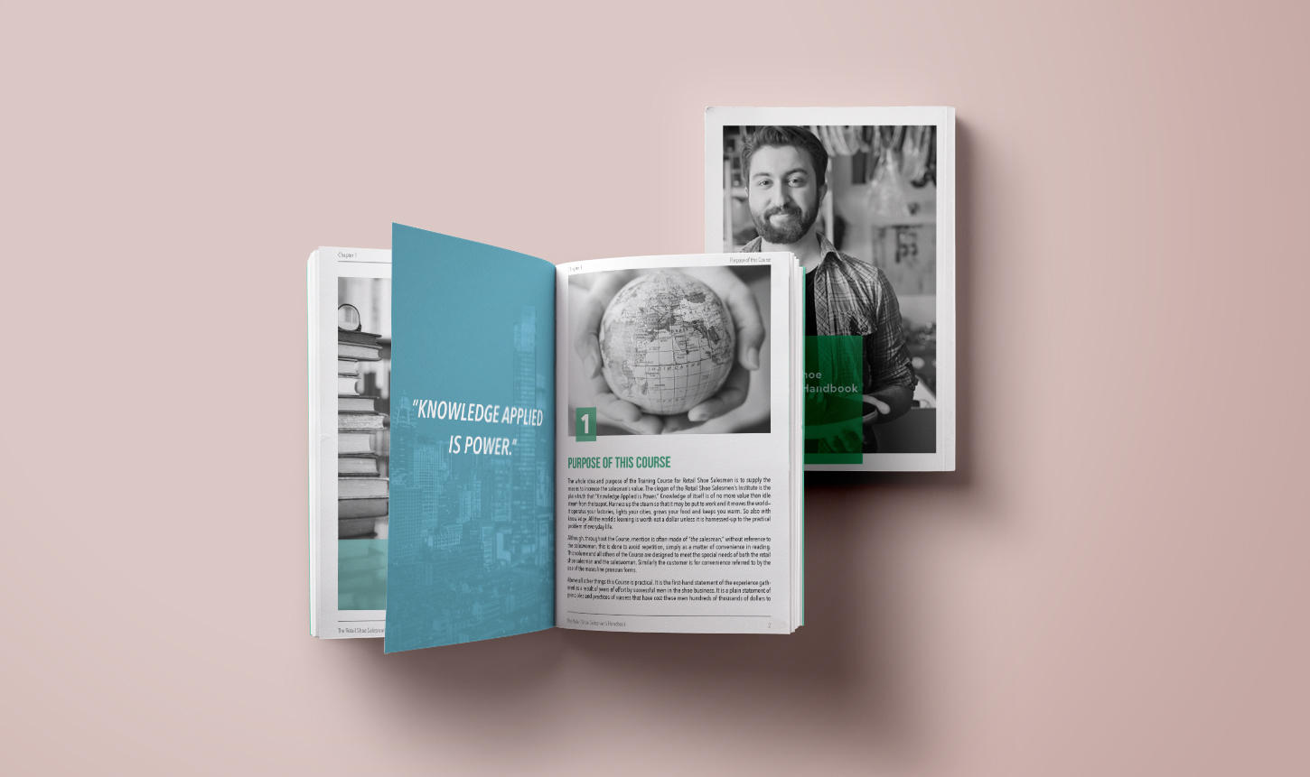
About the Booklet
This project was presented to our team as a way to test our skills with grids, typography and creating effective paragraph styles. We were required to use only black and white photos and all copy had to fit within a 24 page limit.

Color and Typography
I chose to keep the colors monochromatic and minimalistic. My goal was to play off the requirement to use black and white photos by enhancing them with a pop of brightness which made the images better stand out and created visual interest.
Grid and Layout
For the layout, I went with a base grid that was three columns by five rows. I also added an additional break in the middle of the second column and the third row for increased placement options. I gave equal weight to the images and text on the page so that the reader could better process the information in small chunks and not get overwhelmed by the amount of text presented.


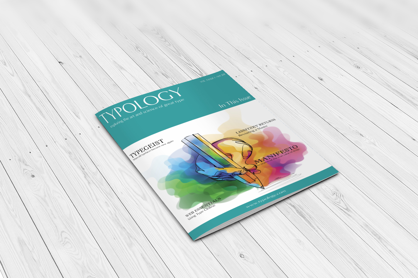
About the Magazine
For this project we were asked to create a magazine focused on either typography or design. We were required to incorporate three articles and the rest was at our own discretion. I added 5 articles total plus advertisements. Goals for the project were to work with typography pairing and overall magazine layout. We learned all the different parts of a magazine as well as ways to organize images and copy so that they were visually pleasing to the reader.
Color and Typography
For this project I picked the colors green and blue to work with. I was aiming for a literary vibe mixed with the look and feel of a high end magazine. I felt like this color palette was bright and inviting yet still refined. My typography choices included Cochin for the titles and Minerva Modern for the magazine title, subtitles and body copy.
Grid and Layout
For the layout, I went with a modular grid that was three columns by three rows. I tried several unique layouts for image display as well. If you would like to view the complete magazine you can download the pdf here for further viewing.


Overall Results
Through the completion of these two projects, I advanced my skills with typography, grids and layout. I gained a better understanding with regards to successfully pairing types and increased my proficiency with grids and layout. These were two of my favorite projects to date.